We can change to this mode of UI in the Create New Post that I think makes the tag usage easier. There's help text under the window in this screen shot and it will contain instructions on the use of tagging, the benefits and also a link to a standing post to request new tags. I think this method of operation will allow us to add many more tags without making them burdensome to navigate.
Thoughts?
Not quite sure how to connect groups to tags in this UI but that might be the next step.
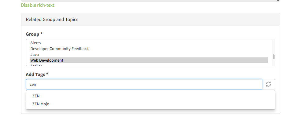

this is a better interface for choosing tags than a long drop menu.
Yes, more like SO (as always, a good idea).
I can't count how many times I've hit post and been told I have to include a tag, then selected a tag and been told again because I forgot to click "Add"! 3 clicks is ridiculous!!! </halfjoking>
We need to hold on this. New "typing" widget for tag selection works fine for single tags but not well for multiples. Need to check out other options. I did convert the Groups to a selection list and fixed sorting which I thing looks and works better.
Hmm, I assumed this was a temporary thing. I hope you've seen my thoughts on the group debate? Regardless of opinion and whatever the fix, I think it's reasonable not to expect people to select essentially the same thing twice. For instance, if I post community feedback I have to select the "Community feedback" group and tag it with "community feedback".
Currently testing this variation which has type-to-select dropdown and multi-selection. Kind of like JIRA's if you're familiar with that.